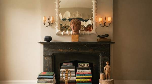
Styling a bookshelf is less about filling every slot and more about composing it. Interior designers who write about shelving converge on the same core moves: vary how the books sit, use them as anchors, group objects so they read as single visual units, and leave room for the eye to rest. The practical answer for most shelves is a sequence—books first, then objects, then balance—and one expert rule of thumb, a 60/30/10 split of books, decor, and negative space, offers a concrete target for getting there.
Introduction: Beyond Storage – The Art of Bookshelf Styling
A bookshelf full of books is functional; a styled bookshelf is a feature. Designers treat shelving as an opportunity to turn storage into display, layering texture, color, and personal history into a room's vertical plane. Sarah Gibson, writing at Room For Tuesday, argues that books are the true foundation of shelf styling—she thinks too many shelves are styled with too few of them—and that a curated look comes from mixing orientations, odd-numbered groupings, and vintage or collected pieces that add character. The Chris Loves Julia team, styling their own living room shelves, describes the process as purposeful composition: deciding in advance where art will go, and grounding the visually heavier lower shelves with a row of books. The framework below synthesizes those shared principles into a repeatable process.
Step 1: Establish Your Foundation with Books
Start by sorting your books by size, a preparation step Laura Cox of Sarah Montgomery Interiors recommends so you can grab workable books easily. Then build a few horizontal stacks to serve as anchors—these become the structural bones of the arrangement. Varying horizontal and vertical stacking is the single most repeated technique across all three sources: vertical spines give height, while horizontal stacks break the monotony of a wall of upright books. Those flat stacks do double duty as risers and pedestals, elevating objects that would otherwise sit low and feel lost.
Cox also offers a practical trick for imperfect books: if a title is silly or a spine color fights your palette, turn it around—no one will notice. Gibson goes further, suggesting that jackets can be removed, or books flipped backward entirely, for a neutral, monochromatic look, provided you won't need to read the titles often.