The most successful film adaptations of classic literature do more than just recount a story; they transmute the novel's rhythm and atmosphere into a distinct visual language. These films succeed not by being overly respectful of every plot point, but by being bold enough to reinvent the source material for the eye. For the design-conscious viewer, understanding this translation is key to appreciating the artistry of adaptation. By examining the cinematic choices behind Stanley Kubrick’s Barry Lyndon (1975) and Joe Wright’s Pride and Prejudice (2005), we can see how two very different visual strategies can both masterfully interpret a classic novel, offering a blueprint for what to look for in any literary adaptation.
Barry Lyndon (1975): A Painterly Recreation of the 18th Century
Stanley Kubrick’s 1975 adaptation of William Makepeace Thackeray's novel is often celebrated as a cinematic masterpiece for its painstaking attention to period detail. The film’s visual strategy was to bring the 18th-century world to life with a degree of authenticity rarely seen in period dramas. Kubrick and his team achieved this through an intricate blend of natural and artificial lighting techniques, creating a look that feels both authentic and highly stylized. The production famously eschewed electric light for many outdoor scenes and, in a now-legendary technical feat, used custom, NASA-developed lenses to film scenes lit only by candlelight.
This meticulous approach gives the film an almost documentary-like quality, presenting a detailed vision of the manners, morals, and daily life of the era. The result is a deliberate, often static visual style that mirrors the composition of 18th-century paintings. According to one analysis, the film’s dominant use of music and its visual precision "traps you in that world." This immersion is not an attempt to simply re-create life as it was, but as one critic noted, "an attempt to bring to life how these people wanted to have been seen." The camera becomes an all-seeing, detached observer, steeping the audience in the period's aesthetic and social confines, making the visual design a form of social commentary in itself.
Pride and Prejudice (2005): Emotional Resonance Through Visual Storytelling
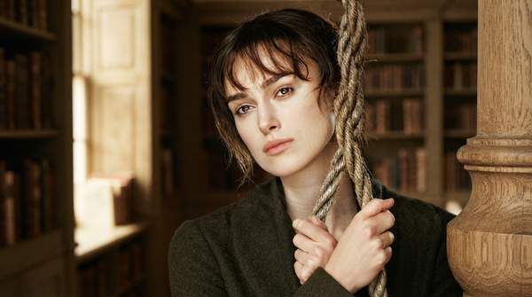
In stark contrast to Kubrick's observational detachment, Joe Wright’s 2005 adaptation of Jane Austen’s Pride and Prejudice employs a more modern and emotionally driven cinematic language. Diverging from earlier adaptations like the 1995 BBC miniseries, which focused heavily on historical accuracy and detailed character development, Wright’s film uses sweeping landscapes, lush cinematography, and an evocative musical score to build a deeply romantic atmosphere. The visual aesthetic is intentionally designed to amplify the sensory and emotional experiences of its central characters, Elizabeth Bennet and Mr. Darcy, making their internal feelings externally visible.
This approach was praised by critics for its fresh take on a beloved classic. The film’s success lies in its ability to blend period detail with a "modern sensibility," making it accessible to both longtime Austen admirers and new audiences. By emphasizing the emotional core of the narrative through its visual design, Wright’s adaptation reframed the story for a contemporary audience that values personal authenticity. The film demonstrates how cinematic techniques can translate a novel's internal psychological depth into powerful external imagery, creating a version of the story that feels both timeless and immediate.